Sunday, 31 January 2016

Steampunk Project

 The most recent Visual Design project was another 2 week long one. This time we were given the task to create anything we wanted, as long as it was in the Steampunk style. I have known about Steampunk for some time so I had a basic understanding of it. I complied a moodboard together to give myself an overview of the Steampunk theme.

 Then I started a few sketches to figure out what I wanted to do for my project. I knew I'd like to do a character but I also thought about doing a plane of some sort. After these sketches I decided I did not want to do a plane.


 Next I needed to do more roughs for my character because I did not have a clear idea of hat I wanted to do. I knew I wanted it to be a robot and that I wanted it to have a weapon as a big part of the design. Instead of doing more roughs in the sketchbook I decided to do some in Photoshop because I have been finding it hard to figure out my ideas on paper.

 I ended up doing a separate rough as well which I ended up not wanting to take further. These roughs led to my final three solid ideas. So I decided to go with idea number 1, even though looking back some of the others look like they could have been better ideas. 

So I took idea 1 further. I used the rough for reference by keeping it on a layer under the one I was drawing on and erased it as I went. I also closely referenced my moodboard and images of brass to get the look I wanted. For the eyes I had a brief look at camera lenses to get them looking nice. I watched this video from this time stamp to look at how I might draw my robot. I found it quite useful. Anyway, here is my final design. I am very pleased with how it turned out but I know there is room for improvement in the lighting.

Wednesday, 20 January 2016

Mutated Fish VD-S15

This week's visual design session was really fun. We had the whole 2 hours to design a 'mutated fish' without much other detail. I ended up going down a path which led me to fish covered with tumours and mouths filled with teeth. If I had had more time on this I would have detailed out the final a bit more but I am very happy with the results.

Life Drawing S13

Today's life drawing was interesting as you can see from the green dots. I did this with a stamp pen in the shape of a star. It was fun to make and I like the overall effect. We also focused on feet for our final drawing today as we are going to be looking at modelling them in 3D later on.


Tuesday, 19 January 2016

Life Drawing S07

This session got us to mix different media and focus on a specific area of the model. I found this session's methods interesting to try.


Life Drawing S06

This life drawing session had us try a really interesting but challenging technique. For the last 2 images you see here we drew with both hands at the same time.


Life Drawing S11

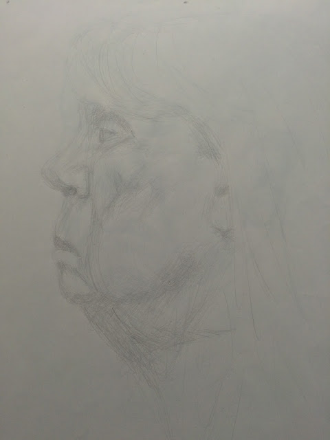
This session had us focus on the face. As you may have gathered from my other life drawings I tend to ignore the face because I'm not that good at doing them quickly. Luckily we had more time to draw the face. We drew the model's face from two different angles and with two different media.


Life Drawing S10

This session of life drawing had us label the bones on the body and focus on different areas of the model. I chose to challenge myself with the hands and the neck which are also my favourite drawings from this session.


Life Drawing S12

This session was mainly for us to focus on drawing hands and labelling the muscles. We could either draw one of the model's hand or draw our other hand. I chose to draw my other hand.


Life Drawing S08

This session of life drawing got us to add some perspective to our drawings by placing square pads with a circle and cross around the model.


Life Drawing S09

The first few drawings from this session were drawn from the ground creating a worm's eye view perspective.


Sunday, 17 January 2016

Paintovers VD-S014

This weeks Visual Design session had us practising the paintover technique in phothshop. To start we were given a simple rendered 3d model and a texture to overlay. The first image shows my interpretation of this. Then we were given an image of a vampire type creature model which looked to be a photo of a real model. The second image shows what I did with mine. I am very happy with the leather texture I applied to the model.

Muscle Anatomy 02

For the second part of this project we had to draw a full body figure of muscles. We needed a front and back view. I decided to do a pencil drawing in the same way I did this for the skeletons.

Sunday, 10 January 2016

Muscle Anatomy 01

This weeks Visual Design project is the first of a two part project. We are progressing with the anatomy and are moving on from skeletons to muscles. The first part of the project is looking at key muscles. Here are my sketches.

Monday, 4 January 2016

Skeleton Anatomy

Ooooo Spooky Skeleton! 
Over the Christmas holiday we had been set a project that would help us better understand anatomy. We had to study the human skeleton, make sketches of key areas, and then create 3 final drawings of the complete skeleton. One from the front, one from the side, and one from the back. Here is my work.