
Showing posts with label Visual Design. Show all posts
Showing posts with label Visual Design. Show all posts
Wednesday, 13 April 2016
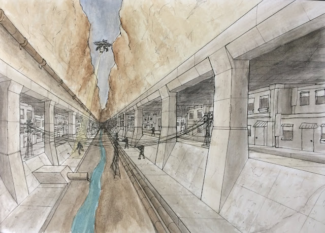
Perspective Environment
I have no idea why this wasn't posted before now. This was the second project we had to do. It is a one point perspective drawing coloured with watercolours. I have always struggled to use watercolours but I really enjoyed this one! When I was drawing this I felt like the scene was a bit empty so I added in a helicopter and some guys shooting at a runner. I am not sure how I feel about the runner's pose though. I also think that I could have done the lighting much better but as I mentioned, I do not really like watercolours. Overall I am happy with how this turned out.
Monday, 11 April 2016
Speed Arts
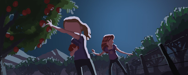
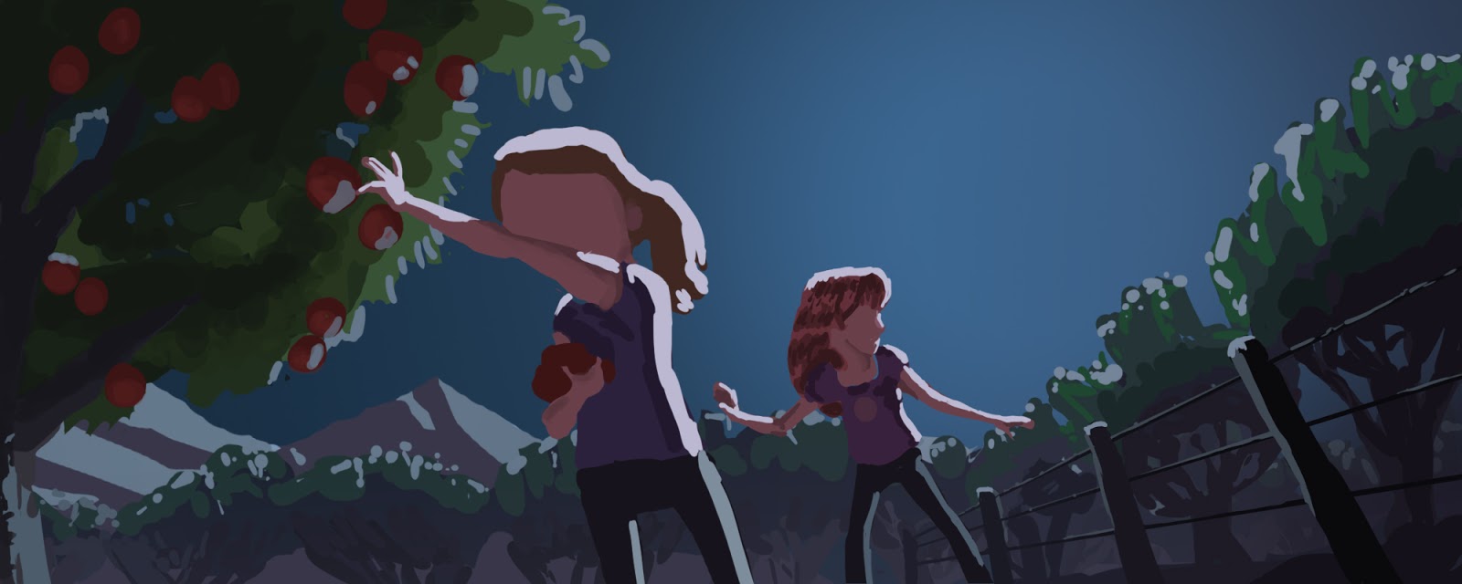
It seems I never posted these two speed arts. The first is of a face and was for us to practice techniques to speed up. The second was for us to practice doing things from the furthest to the closest. I used a brush with opacity to do the first one and I used a hard full opacity round brush for the second.


Blob and Whale Boy VD-S23
This session of Visual Design got us to look at lighting to start. We were given a silhouette shape and were told to light it. I decided to do a shiny material blob.

Then we did another speedpaint. This time we started copying from a small blurred version of the image we were speedpainting to help us ignore the details and block everything out. Then once we had everything in basic form we looked at the high res version of the image. I did not finish the paint but I am happy that I managed to get most of the proportions correct. However, I struggled on colour and lighting.


Then we did another speedpaint. This time we started copying from a small blurred version of the image we were speedpainting to help us ignore the details and block everything out. Then once we had everything in basic form we looked at the high res version of the image. I did not finish the paint but I am happy that I managed to get most of the proportions correct. However, I struggled on colour and lighting.

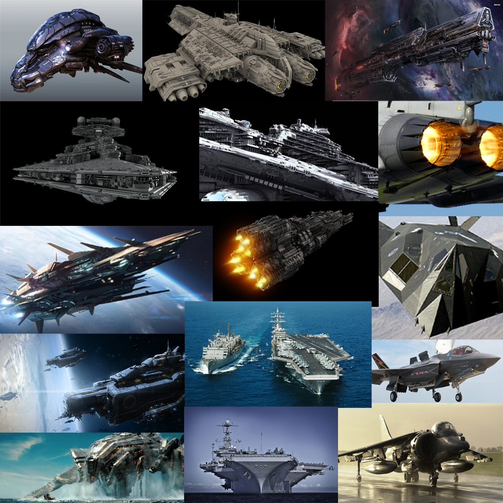
Spaceship Forms VD-S22
This session of Visual Design was a precursor to the homework. We watched a video on how Scott Robertson designs spaceships. Then we had to create roughs for a construction vehicle spaceship. We had to do two types of spaceship. Some hard angles and some organic shapes. I really enjoyed doing the hard angled spaceships but the organic shapes I did not. My favourite ship of this lot is the bottom left. I'm really happy with the shapes that came through on it.


Environment Composition VD-S21
This session of Visual Design was for us to look at the composition of concept art. We watched a video to start which talked about methods like 'The rule of thirds' and 'The golden ratio'. Then we had to do a speed art of a house but in a larger scene from our own imagination and based on the rule of thirds. I really enjoyed doing this as I find it fun to try to replicate the style of someone else's art. The first image is the original image and the second is my take on it. Although I did not finish the image fully I feel like I did the composition of the image quite well.


Friday, 1 April 2016
Space Ship Part 2
So I decided to go with a view from behind the space ship because I felt there would be more interest with the engines visible. I wasn't entirely sure what I wanted to do to the ship so when I first attempted a paint over I ended up with this.
 I wasn't too unhappy with this but I felt like something was missing. So I went back to it later and added some more panel lines, vents, changed the engines a bit, and edited the atmosphere of it. I am much happier with this now.


Sunday, 13 March 2016
Space Ship Part 1
This weeks visual design project is the first of a 2 part project. For this project we have to design a sci-fi military spaceship. As normal I started by looking at pre-existing spaceship designs and real vehicles for reference. From these I compiled a moodboard.
 We had the choice to go for either a transport or fighter spaceship. I decided to go for a transport. I wanted to design a transport vessel that has the capability to carry a huge number of fighter ships. I decided to use aircraft carriers for some inspiration. I looked at the book Blast to look at how I might go about designing a ship. Then I sketched a few spaceships.
 I took two of them into Photoshop to make more sense of.
 I chose the top ship and created a basic 3D model to see what I thought of it. I added in some smaller fighters coming from it because I wanted to show that this is a huge transport ship similar to an aircraft carrier. I am happy with how it turned out.


Sunday, 6 March 2016
Mech Copying
This Visual Design project had us start with a silhouette already which we then had to fill in with shading based on an existing image. Then, using perspective and opacity, we had to position several copies of this at different distance from the first.


Star Wars Speeder Perspective VD-S19
So this was an interesting session... What started out as another lesson in perspective turned into something else for me. But before I explain what happened this was some of my inspiration for this https://www.youtube.com/watch?v=58mah_0Y8TU. :D
Ok, so jokes aside I did find this session helpful for turning model sheets into a perspective drawing by constructing a basic grid structure. I ran out of time and had a funny thought which is why the final thing ended up like this.
EDIT: I went back to this and quickly redid it to end up with this.

3 Point Perspective VD-S18
So this session of Visual Design got us to take the perspective room from one of our previous projects and turn it into a 3 point perspective image. I enjoyed the challenge but found it hard to convert so I was not able to finish it.


Colouring Yoda VD-S20
This weeks visual design lesson had us look at colour and saturation. We watched a video that covered the basics and then put it into practice by colouring some grey Yoda art.


Tree with Character
This weeks Visual Design project was to design a tree with character. Not a character that is a tree but a tree that has character to it. So to start I created a moodboard of trees.
 Next I created some roughs on paper and some sketches of bark for reference.
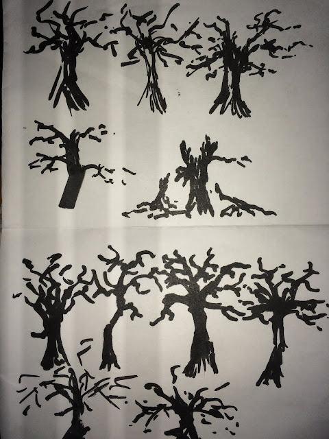
 Then I created more roughs in Photoshop.
 I chose to take 3, 4, and 6 further.
 I decided I liked the middle tree the best and I knew I wanted to have lightning in the final piece. I am very happy with how it turned out but I think that there should have been less rim lighting on the right hand side of the tree.


 Then I created more roughs in Photoshop.


Friday, 26 February 2016
Animated Sprites VD-S17
This session was all about animating sprites for 2D games. We were taught how to use the timeline in Photoshop to animate. We did not create our own animations in this session but added to existing ones. To practice this we added eyes(2 pixels) to one sprite and moved them about. Then we were given an animated sprite and told to add anything to it. So I did this.


Creature Lighting VD-S16
In this session of visual design we looked at lighting a creature. We did not create the line art for this. We looked at a video showing the shadow on an egg which really helped me understand how shadows and lighting work better.


Thursday, 18 February 2016
Insectoid Character Design 2
So for the 2nd Part of the Insectoid Character we had to create a three-quarter view of our character. I wasn't quite happy with the rendering of the bug in the model sheets so for this view I painted it differently. I experimented with a brush I have not used before which creates a canvas effect. I actually really like it. I also did the character at a different state in its life-cycle. This version of the bug is engorged. I am much happier with the colours and rendering of the egg sack this time. You can see some of the eggs through the surface and it generally looks more transparent than the model sheet version. I took inspiration from termite queens for this.


Sunday, 14 February 2016
Insectoid Character Design 1
This week's Visual Design Project was to design an insect based character. I wanted to go with a non-humanoid character for this. I created a mood board of insects and a few existing designs which I liked.
 Then I created multiple sketches using pencil and markers to find a design I wanted to make. I eventually decided that a bug with an oversized egg sack would be cool.


 Then I took the final 3 designs into Photoshop to detail out a bit more before I made a final decision on which one to go with.
 I decided to go with the egg sac insect so I took it even further.
 So instead of taking this rough and making it into a final concept we had to make a model sheet for it. This is so we can practice making model sheets from concept art to 3D model. Before I show you my model sheets I will tell you the description of this insect.
This insect starts life quite small. It lives on a large, oxygen-rich planet inhabited by huge insects that would tower over humans. This insect starts life by searching for a large colony of another species of insect. When it finds a suitably large colony it finds and kills the queen of the colony and takes her place, in a similar fashion to cuckoo birds with their eggs. She consumes the queen and replicates her scent to prevent confusion amongst the colony. Over time she consumes the colony by eating the workers that bring her food. AS she does this large armour plates grow out of her abdomen which support a growing egg sack. Eventually, this sack grows too large and explodes, killing the insect it is attached to. Hundreds of larvae instantly hatch and begin attacking each other. They attack each other until a fraction of the brood remains. The remaining larvae will eat the corpse of their mother before making their way to the surface. Many will die on the way as they encounter the confused colony. Once at the surface they rapidly pupate and after a short period of time they hatch into their adult form and the cycle begins again.
Anyway, here are the model sheets for this creature at a partially engorged state. I have kept the line work quite heavy in these so that it would be easier to establish shapes to 3D model.
Front:
 Side:
Side:
 Back:
Back:

Looking Back at the design after finishing it, I would have made the insect more complex. I would have given the head and thorax large plates of armour to make it look more menacing. I think I should have incorporated some of the wasp insect rough design into this insect. Overall, I am happy with the design but in future I will try to make my designs slightly more complex and detailed where they perhaps should be.


This insect starts life quite small. It lives on a large, oxygen-rich planet inhabited by huge insects that would tower over humans. This insect starts life by searching for a large colony of another species of insect. When it finds a suitably large colony it finds and kills the queen of the colony and takes her place, in a similar fashion to cuckoo birds with their eggs. She consumes the queen and replicates her scent to prevent confusion amongst the colony. Over time she consumes the colony by eating the workers that bring her food. AS she does this large armour plates grow out of her abdomen which support a growing egg sack. Eventually, this sack grows too large and explodes, killing the insect it is attached to. Hundreds of larvae instantly hatch and begin attacking each other. They attack each other until a fraction of the brood remains. The remaining larvae will eat the corpse of their mother before making their way to the surface. Many will die on the way as they encounter the confused colony. Once at the surface they rapidly pupate and after a short period of time they hatch into their adult form and the cycle begins again.
Anyway, here are the model sheets for this creature at a partially engorged state. I have kept the line work quite heavy in these so that it would be easier to establish shapes to 3D model.
Front:


Looking Back at the design after finishing it, I would have made the insect more complex. I would have given the head and thorax large plates of armour to make it look more menacing. I think I should have incorporated some of the wasp insect rough design into this insect. Overall, I am happy with the design but in future I will try to make my designs slightly more complex and detailed where they perhaps should be.
Sunday, 31 January 2016
Steampunk Project
The most recent Visual Design project was another 2 week long one. This time we were given the task to create anything we wanted, as long as it was in the Steampunk style. I have known about Steampunk for some time so I had a basic understanding of it. I complied a moodboard together to give myself an overview of the Steampunk theme.

Then I started a few sketches to figure out what I wanted to do for my project. I knew I'd like to do a character but I also thought about doing a plane of some sort. After these sketches I decided I did not want to do a plane.

Next I needed to do more roughs for my character because I did not have a clear idea of hat I wanted to do. I knew I wanted it to be a robot and that I wanted it to have a weapon as a big part of the design. Instead of doing more roughs in the sketchbook I decided to do some in Photoshop because I have been finding it hard to figure out my ideas on paper.


I ended up doing a separate rough as well which I ended up not wanting to take further. These roughs led to my final three solid ideas. So I decided to go with idea number 1, even though looking back some of the others look like they could have been better ideas.
So I took idea 1 further. I used the rough for reference by keeping it on a layer under the one I was drawing on and erased it as I went. I also closely referenced my moodboard and images of brass to get the look I wanted. For the eyes I had a brief look at camera lenses to get them looking nice. I watched this video from this time stamp to look at how I might draw my robot. I found it quite useful. Anyway, here is my final design. I am very pleased with how it turned out but I know there is room for improvement in the lighting.

Wednesday, 20 January 2016
Mutated Fish VD-S15
This week's visual design session was really fun. We had the whole 2 hours to design a 'mutated fish' without much other detail. I ended up going down a path which led me to fish covered with tumours and mouths filled with teeth. If I had had more time on this I would have detailed out the final a bit more but I am very happy with the results.


Sunday, 17 January 2016
Paintovers VD-S014
This weeks Visual Design session had us practising the paintover technique in phothshop. To start we were given a simple rendered 3d model and a texture to overlay. The first image shows my interpretation of this. Then we were given an image of a vampire type creature model which looked to be a photo of a real model. The second image shows what I did with mine. I am very happy with the leather texture I applied to the model.


Muscle Anatomy 02
For the second part of this project we had to draw a full body figure of muscles. We needed a front and back view. I decided to do a pencil drawing in the same way I did this for the skeletons.


Subscribe to:
Posts (Atom)