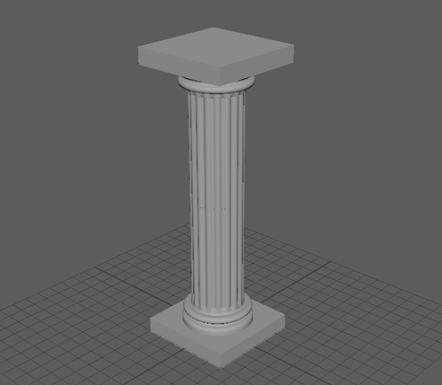
After this we practiced some new modelling techniques. To do this we modelled a column using an image from side view. We used the curve tools and soft selection to achieve the curved shapes of this pillar.
Monday, 30 November 2015
Rock 3DAP-S03
This weeks 3D Art Production had us experimenting with more tools in MAYA. The first part of the tutorial we followed introduced us to the scultping tools in Maya. We made a rock to practice using them.
After this we practiced some new modelling techniques. To do this we modelled a column using an image from side view. We used the curve tools and soft selection to achieve the curved shapes of this pillar.
After this we practiced some new modelling techniques. To do this we modelled a column using an image from side view. We used the curve tools and soft selection to achieve the curved shapes of this pillar.
Barrel 3DAP-S01
The first session of 3D Art Production involved us getting used to Autodesk Maya. To do this we were given a tutorial on how to make a barrel. The tutorial covered some of the more essential tools. This tutorial also taught us about UV mapping. Once we had modeled a barrel we took several UV Snapshots. One of the outlines of the UVs, one of the coloured materials and one of ambient occlusion. We combined them in Photoshop and added some textures before bringing it back into Maya on a lambert material. I ended up with this as my final barrel.
I could have made a better texture for this barrel. It needed a bit more work to make it suit the low poly style of the model. I could have made the texture more cartoony. I am happy with the result though and now know how to model and texture, to a degree, in Maya.
I could have made a better texture for this barrel. It needed a bit more work to make it suit the low poly style of the model. I could have made the texture more cartoony. I am happy with the result though and now know how to model and texture, to a degree, in Maya.
Sunday, 29 November 2015
Futuristic Tank
This weeks visual design project was to make a perspective futuristic tank using the halfway to black technique. We started with a moodboard as usual and then created some sketches and ended up with a final thing in photoshop. I must admit I did not stick to the technique. I found it was taking too long so did some of the shading by eye. Anyway, here is my tank.
FRAMBO! Anthropomorphic Frog
This week's Visual Design project had us create an anthropomorphic frog. We were shown a Feng Zhu video about using images and linework to make concept art and were advised to use to use his technique. I did. I did have linework but decided to remove it to make it look nicer. I decided to make a frog mercenary dude. I made this live on Twitch.tv and with the help of my viewers decided to call him Frambo. I am incredibly happy with the result. Here he is.
Sunday, 15 November 2015
Perspective Room
This weeks Visual Design project was to create a sci-fi style room using perspective. We traced an existing image for the perspective and then filled the room with our own stuff. I drew objects using linework and then painted behind them so that the linework was still visible. I'm really happy with the result.
Sunday, 8 November 2015
Dwarf And Elf Proportions VD-S03
This weeks session of Visual Design taught us about proportions. We had to make an elf and a dwarf but they had to be a certain height. The elf had to be 9 heads high and the dwarf had to be 4 high. The other body parts had to be sized differently to fit these heights. We could use any method of painting we wanted. I chose to use the silhouette method I used with the crustaceans. I am happy with the proportions but not the way I painted the armour on the elf. I used too many highlights. As you may have noticed, there is a large difference between the elf and dwarf's styles. I don't like either of the styles and feel like I should have used a mix between the two. The brushes I used on the elf were too sharp and the dwarf too soft. Anyway, I am happy with the proportions.
Perspective Analysis VD-S07
Week 7 of the visual design class had us analyzing images for perspective. We put images into Photoshop and Using the pen tool drew in the lines to indicate perspective, vanishing points and the horizon line.
Here is my analysis of these images.
Here is my analysis of these images.
Zombie VD-S06
This session of Visual Design was a bit different. We had to work on a texture for a zombie. However, the initial texture we were given was for a human and had none of the features for a zombie. To start, we had to find a material texture online for a jumper and replace the pre-existing one. Then we made/found a logo to put on the jumper. Lastly we had to find a face online to replace the existing one with. I chose Ronda Rousey's face, the zombie is female, but other people chose other people's faces. The funniest, and creepiest, was a zombie that had the face of Mr. Bean. Finally we had to 'zombify' our texture. We could do this in anyway we liked. Using images of 'flesh' that I found online I made it look like the zombie had lost its jaw. I also added some blood splatter textures to the zombie's clothes. Lastly I used a brush to add some dirt. We then applied the texture to an animated model in Maya.
Here is my texture and the final model in Maya:
Here is my texture and the final model in Maya:
Tentacle Monster
So this weeks visual design project was to come up with a tentacle monster. As normal we started out by making a moodboard for inspiration.
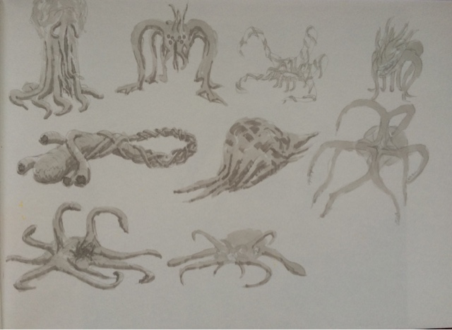
Then we created some sketches/roughs. My favourites were all the creatures on the left of the page. However, I could only choose one so I went with the top left creature.

So I started making the silhouette of the top left guy but when I had it finished it looked a bit unimpressive. So I added a large bulk to the top of it and 2 pairs of tentacles. I also added smaller tentacles to the monster's shoulders. Once I had completed the monster I thought it looked a bit bland. So I decided to experiment and, using a similar technique with layer styles as the lava monster, added electricity to the large tentacles. I was happy with the result so added a colour layer to show the light on the tentacles. I am very pleased with this monster.
Then we created some sketches/roughs. My favourites were all the creatures on the left of the page. However, I could only choose one so I went with the top left creature.

So I started making the silhouette of the top left guy but when I had it finished it looked a bit unimpressive. So I added a large bulk to the top of it and 2 pairs of tentacles. I also added smaller tentacles to the monster's shoulders. Once I had completed the monster I thought it looked a bit bland. So I decided to experiment and, using a similar technique with layer styles as the lava monster, added electricity to the large tentacles. I was happy with the result so added a colour layer to show the light on the tentacles. I am very pleased with this monster.
Monday, 2 November 2015
Lava Practice VD-S05
In this weeks Visual Design lesson we were playing with layer styles to get a lava effect. We started by drawing lava cracks on a black background. We did this with a yellow, hard, round brush. Then we applied inner and outer glows to the layer we had drawn on. This made it look very much more like lava. To top it off we added a texture.
Then we applied this technique to a pre-existing image to practice for our homework, making a lava monster. We were given an image of a clay rock monster model and we had to use this technique on it to make a lava monster. I also added a gradient map to make the colours blend with the rock better.
Then we applied this technique to a pre-existing image to practice for our homework, making a lava monster. We were given an image of a clay rock monster model and we had to use this technique on it to make a lava monster. I also added a gradient map to make the colours blend with the rock better.
Caterpillar Dude Painting VD-S02
In this week of Visual Design we practiced our painting techniques by coloring in line work. We were given the linework to paint over and a colour palette.
This is the linework we were given.
This is my final piece. I added some background to the image because I had extra time.
I am mostly happy with how I painted this but there are still black borders in places and that annoys me a bit.
This is the linework we were given.
This is my final piece. I added some background to the image because I had extra time.
I am mostly happy with how I painted this but there are still black borders in places and that annoys me a bit.
Robot Copying VD-S01
In the first week of Visual Design we had to copy a robot picture in Photoshop. This was to help us understand silhouette drawing and value. I am generally happy with my result but I rushed the legs and the hand on the left is too bulky. I also don't like how I made the lighting on the stomach.
Subscribe to:
Comments (Atom)


