Two quick sketches done in today's session of concept art. I am happy with them for the time they we're done in.
Thursday, 22 September 2016
Concept Session warm up
Two quick sketches done in today's session of concept art. I am happy with them for the time they we're done in.
Sunday, 18 September 2016
Cyborg Project #6 - Maps
I thought I'd post the final maps/textures that I exported from quixel. I adjusted them slightly without Quixel just to add a few extra things.
Cyborg Project #5 - 3D Modelling
I rigged and posed it and while the rig wasn't great I was happy with what I had.
Then I made a UV map but at the time it was not showing me the correct red to blue colours, so I got the sizing on it wrong. I found this out when I made 2048 maps and put them into Quixel. I do not have any screenshots of this but it looked poor.
The cause of the large ugly black areas was because I had a smooth mesh display on the flesh part of the cyborg. This is the bad modelling I had done that caused the smooth display to go weird. I ended up painstakingly making these one sided polygons 3 dimensional. The result was worth it in the end. No more black areas.
This is the ID map I made of the updated model. I also added extra polygons to allow for the yellow areas. I had to export this as an fbx and import it into a new scene because no matter what I did I could not get the bake of the map to not have shadows. Importing it into a new scene fixed this but meant the entire mesh was triangulated.
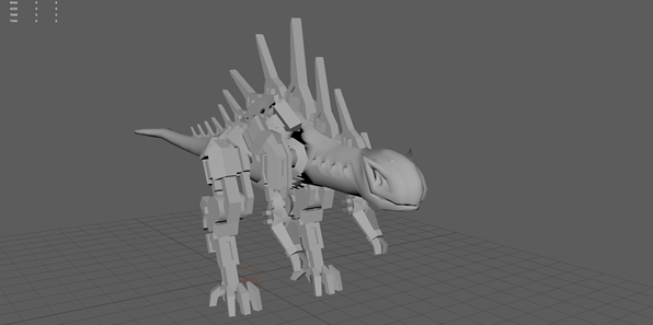
I updated the UV map so that this time everything was more or less the same size. Unfortunately, fixing the smooth mesh display caused my UV map to mesh up and I could no longer unfold things perfectly or symmetrically. So there are some slight errors in the mapping. None the less, doing this was a good idea. Also, I decided to up the resolution of the maps I made to 4096 to get better textures. This was a good idea.
This is what the mesh and final textures I made looks like in Quixel. I was not very adept at Quixel at the time but I am much more confident using it now. I really like the way this ended up.
Now. One of the troubles I had with putting the exported maps from Quixel back into Maya was that I must have exported them in the wrong format. When I went to put them into the DX11 shader I realised that there is no gloss map in it. I ended up using the gloss map as a reflection mask, using a forest picture for the reflection map. I am annoyed by this because it still does not look like it did in Quixel. I also tried putting it into Unity but it ended up looking even worse than this.
This time when I rigged it I made sure to do it properly. However, I made a mistake and the arms became attached to the waist. So it means I had to resize the bones for the final pose. This irritates me because I wanted it to be easy to use. On the other hand, this is the best rig I have ever made and I have learnt so much from this.
Cyborg Project #04 - Model Sheets
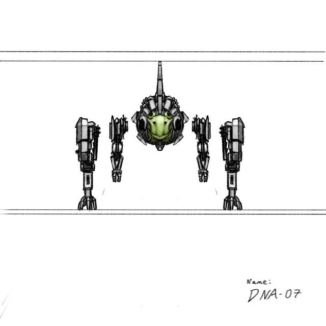
Here are the model sheets for my cyborg. I made these on my iPad. I tried to get as much of the concept into it but reduced the amount of detail so that it would not be too hard to model.


Cyborg Project #3 - Final Concept & Story
Here is the final concept that I have done for the Cyborg. While the background may not be fully fleshed out, my focus for this was the cyborg's design. I am very happy with how it turned out. Below is the rough I did for this soon after the previous further developments. I tried to combine the ideas I likes from each of these concepts and this is the result. As you can probably tell, the rough has lenses on it's face. Only when I started turning this into the final did I decide not to give it eyes but instead large bat-like ears.
Anyway, now that I have the concept done I have made a story for it.
Name:
Subject DNA-07
Story:
[From the progress log of the chief scientist working on Project DNA before the incident] -
LOG 234: After many failed attempts we have finally reached a successful bond between flesh and machine. Subject DNA-07 is the first embryo to survive the procedure. Now we must carry out the first set of tests on the subject to see how durable it is.
LOG 237: The other scientists good mood has been broken. Today DNA-07 killed a handler. As such they all refused to continue with the tests. They do not realise that we cannot afford any delays in our progress! If we fail to meet the deadline then I will be a dead man. The government has grown impatient. They want their weapon.
LOG 253: The remaining handlers have fled into the jungle. The other scientists are questioning my decision to continue the tests. What do a few lives matter. This is science! No sacrifice, no success.
LOG 254: I have run out of time. My fate is sealed. I have but one option left. If I am to die, then it will be at the hand of my creation. However, I will not leave without giving my superiors what they want. DNA-07's smell and hearing have heightened since we removed it's ability to see. The letters I have received should have enough scent on for DNA-07 to seek out those who want my head. That and a little additional programming should do the trick. This is my final entry. Farewell.
[He proceeded to reprogram the cyborg, feed it his superiors scent and free it from it's holding cell. It destroyed him. Most of his body is still missing. DNA-07 is also missing but a covered up attack on a government building has lead conspiracy theorists to believe DNA-07 was responsible.]
Monday, 16 May 2016
Cyborg Project #2 - Developing Ideas
I have taken the ideas from the initial ideas that I had and made some more rough designs. I am really liking the direction I am taking with this. I think that I will make a few more roughs using ideas from all of these. I like the general style of the top left guy but really like the spines of the bottom one. I really like the different style of the guy on the left and the way the machinery is almost keeping the creature imprisoned.
Saturday, 7 May 2016
Cyborg Project #1 - Initial ideas
For the summer break we have been set a project. The project is to design a cyborg. First, design the cyborg in 2D. Then create model sheets to make it in 3D. Finally we must texture it using Photoshop and Quixel. I am very excited about this project. When I first heard the brief I thought of the 'Gievers' in Maze Runner and the Alien Wolf creatures in Transformers 4. I think I will design something along these lines but I have many ideas that I will also try.
To start off, I collected some imagery and compiled a moodboard. I will use more images than these for reference as I design.
Now that I have some idea of the styles I want to experiment with I decided to do some quick roughs. These are not very refined but helped me to eliminate some of the ideas I had. I thought about doing a humanoid creature but decided against it when I realised that it could end up being quite generic, which I don't want. I tried doing these lumbering type creatures which are interesting but I'm not sure if I want to continue developing them.
The next lot of sketches I did were for me to decide what sort of creature I wanted to use as a cyborg. At first I tried a frog like creature but changed my focus to look at lizards. I also decided to focus on the head as I was finding it hard to come up with one in the individual roughs. I really like the head ideas but now I need to find a body to fit them. As I based the heads on snakes and lizards I thought I would try bodies with long tails. I will continue developing this idea.
Monday, 18 April 2016
3D Animation and Rigging
3D Hand
This was to teach us how to model a hand from model sheet images. This was challenging as it is hard to switch between all of the orthographic views and model at the same time. I learnt a lot about this method of modelling doing this. This changed my view on the method and now I like it more than I did when I made the pillar.
3D Tileable Texture
This was to teach us how to make a tileable texture from a 3D model. from a top down perspective and cropped is a tileable texture. This was done by copying one side of the bricks to the other and placing new bricks around them. The final thing is rendered out and put into photoshop where it can be adjusted to the right colours and have textures overlayed etc.
3D Pillar
This was to teach us how to model from the orthographic views. It was relatively quick to do as most of it was modelled by extruding. I am not a massive fan of this method of modelling but I cannot deny that it is very useful to use if you need to model something accurately from side on images or model sheets.
3D Mushroom
This was to teach us how to model using extrude along path and the sculpting tools. It was also to teach us how to texture. The different shaped mushrooms were achieved using the transform tools and deform tools, which were fun to play with. I learnt a lot about Maya doing this.
Final Battle Arena in Unity
So when I put the statue into the existing battle arena in Unity. It looked good but the old arena still needed updating. In the process of doing this I had to update Unity. For some reason when I opened the project again all of the materials had broken and were not fixable. So I had to make a new project. I do not regret this choice as it meant I could start off with the new arena model straight away. I applied all the textures and animated the camera. This time I added in more lights and some alarm lights. I decided to make the ground have blended materials but there was no way to do this in unity without buying a software. I scoured the internet for a solution and found one. I downloaded a vertex painter with blend shaders and got a texture for the ground that I liked. However, for this blended material to appear in the build I have to place a duplicate of the ground object into the scene and not do anything else before building. If I change something after placing in the object, the material does not work. I have used emmisive maps on the crystals to make them glow for extra effect. Lastly, I added in a few sound effects and some music that I have used in a previous project. I also animated a few of the alien ships in the scene to add to the story a little bit and make the arena less static. I am really happy with the way the camera moves through the scene and I like how some of the story is shown throughout the arena.
There is a particle effect that I am really happy with for figuring out myself. On one of the spaceship engines I have made a particle effect for heat distortion. It has been made using the glass material shader and a normal map I made from some random generated clouds in Photoshop. I wanted to mention it because I am very happy with the effect.
Finally, I thought I'd show the final statue in Unity. I have used such a bright light coming in from the left because it shows the detail of the normal map really well and makes the scene more dramatic. I am pleased with the way it turned out.
Friday, 15 April 2016
3D Wagon
The wagon project was a tutorial made by our tutor. We had to apply textures to a premade wagon model using Quixel in Photoshop. I am not a massive fan our Quixel. I like the effects it has for textures and the quality of textures it produces but I do not like the process of making them as such I struggled to use it. I prefer making textures manually but I do see the benefits of using Quixel. However, I managed to get a nice wooden and metal texture for my wagon which I put on the model in Maya and Unity. This taught me about the different maps that I would need for a basic texture.
Wednesday, 13 April 2016
Personal Project: Rusting Metal 1
This project is something that I wanted to do because I have just finished writing a short version, almost a synopsis, of a story that I have been going over in my head for years called Rusting Metal. I started by doing the line drawing that you see below. However, I did not use this in the actual piece because I could not seem to progress it. In the second image you can see the current WIP. I intend to work the angle from the initial line art into the final but for now I decided not to. The dragon type creature that is in this is made of crystal. I had struggled to start painting the crystals but after looking at real crystals and other concept art I managed to render them nicely. So far, the dragon is what I have been mainly focusing on and I am very happy with the direction I am taking with this project. I intend to make the crystals look like they are glowing slightly but I am not entirely sure how, so for now I will continue rendering them as I have been. I can't wait to see it finished!
Art for Practice 3
So I have done some more art for practising various techniques and improving.
The first two were for me to practice form and lighting. I am happy with both of them but neither are in a finished state.
The third one was for me to try doing something that Anthony Jones had done in my own way.
The fourth was for me to try out using different brushes, practice form, and try and recreate the concept artist Matt Betteker's style. I am happy with how it turned out.
I will continue to practice art in a variety of different ways as I can see myself improving in each new piece.
Perspective Environment
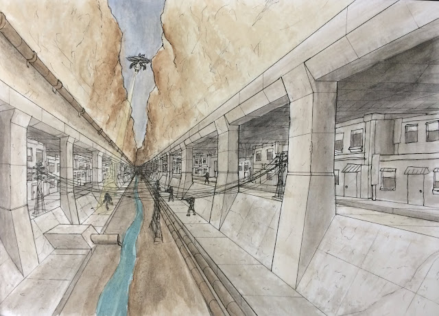
I have no idea why this wasn't posted before now. This was the second project we had to do. It is a one point perspective drawing coloured with watercolours. I have always struggled to use watercolours but I really enjoyed this one! When I was drawing this I felt like the scene was a bit empty so I added in a helicopter and some guys shooting at a runner. I am not sure how I feel about the runner's pose though. I also think that I could have done the lighting much better but as I mentioned, I do not really like watercolours. Overall I am happy with how this turned out.

Life Drawing S19
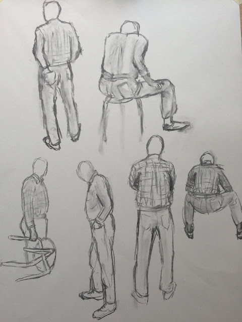
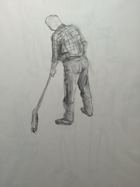
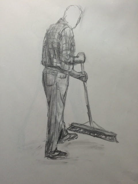
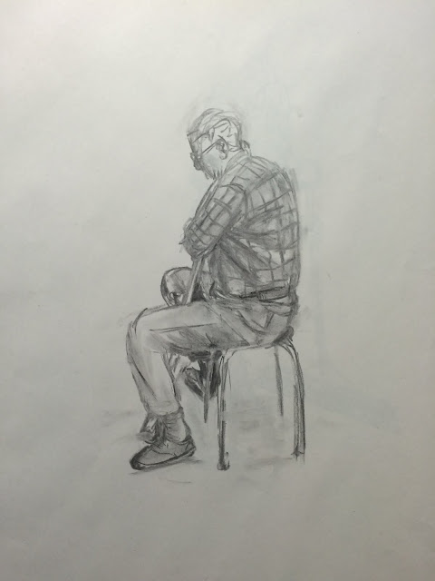
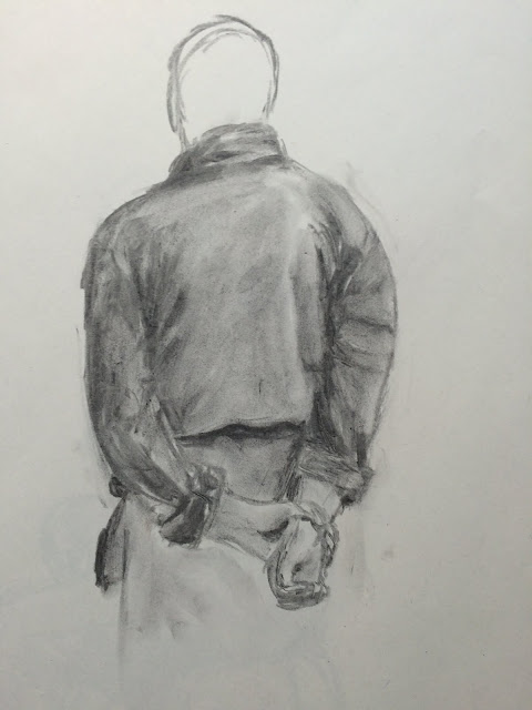
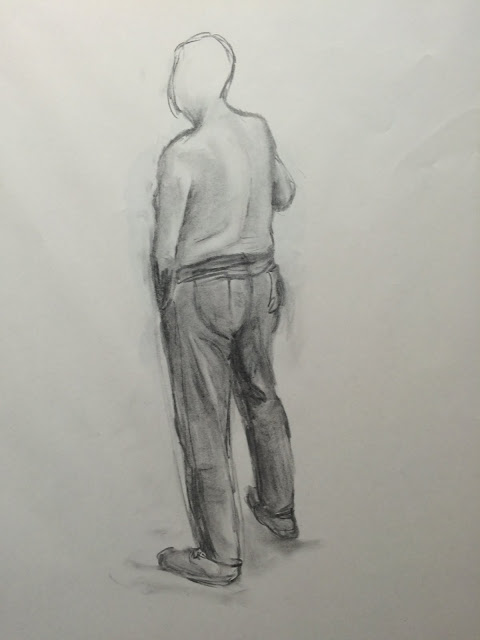
This is the last session of life drawing. Looking back, I would say that these are some of my best yet. I think my favourite of these is the one of his back when he is wearing a dressing gown. I am really happy with the shading. This session had to be done with a clothed model because someone had complained about having to draw a nude model in life drawing. While I, and most others, found this to be a bit stupid I did find drawing clothes to be fun but most definitely challenging.


Subscribe to:
Comments (Atom)


