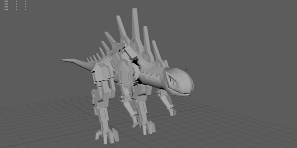
I rigged and posed it and while the rig wasn't great I was happy with what I had.
Then I made a UV map but at the time it was not showing me the correct red to blue colours, so I got the sizing on it wrong. I found this out when I made 2048 maps and put them into Quixel. I do not have any screenshots of this but it looked poor.
The cause of the large ugly black areas was because I had a smooth mesh display on the flesh part of the cyborg. This is the bad modelling I had done that caused the smooth display to go weird. I ended up painstakingly making these one sided polygons 3 dimensional. The result was worth it in the end. No more black areas.
This is the ID map I made of the updated model. I also added extra polygons to allow for the yellow areas. I had to export this as an fbx and import it into a new scene because no matter what I did I could not get the bake of the map to not have shadows. Importing it into a new scene fixed this but meant the entire mesh was triangulated.
I updated the UV map so that this time everything was more or less the same size. Unfortunately, fixing the smooth mesh display caused my UV map to mesh up and I could no longer unfold things perfectly or symmetrically. So there are some slight errors in the mapping. None the less, doing this was a good idea. Also, I decided to up the resolution of the maps I made to 4096 to get better textures. This was a good idea.
This is what the mesh and final textures I made looks like in Quixel. I was not very adept at Quixel at the time but I am much more confident using it now. I really like the way this ended up.
Now. One of the troubles I had with putting the exported maps from Quixel back into Maya was that I must have exported them in the wrong format. When I went to put them into the DX11 shader I realised that there is no gloss map in it. I ended up using the gloss map as a reflection mask, using a forest picture for the reflection map. I am annoyed by this because it still does not look like it did in Quixel. I also tried putting it into Unity but it ended up looking even worse than this.
This time when I rigged it I made sure to do it properly. However, I made a mistake and the arms became attached to the waist. So it means I had to resize the bones for the final pose. This irritates me because I wanted it to be easy to use. On the other hand, this is the best rig I have ever made and I have learnt so much from this.


Online casino apps 2018: more info about their payment methods here. Download, play and get real money.
ReplyDelete