I am making some changes to my battle arena to make it look better and for the story to show through in it more. I am also changing it to accommodate for the statue. I need to update some of the textures also to be higher resolution because it will look odd with a high resolution statue next to a very low resolution environment. Previously I made a single texture for the terrain so that I could have ambient occlusion on it. However, I need a tilable texture to get more detail around the statue area. I have decided to make it a blend shader to get even more variation in the environment. I could make it in Maya but I would just have to recreate it in Unity so I have decided to make the new texture once I have got the FBX version of the arena into Unity. I will however, render out UV and ambient occlusion maps for the new models as I make them.
I have an idea to better lead the viewer through the arena. I will use an alien spaceship with a spotlight to highlight areas of the map as the camera travels round it as it is particularly hard to see the arena in the current Unity build. To start changing the arena I added in some spaceships above the arena and also some crystals to show the mineral that is being mined. I also added a tiny bit more detail to the statue's base. Here is the new arena model.
Friday, 25 March 2016
3D Statue Textures
The texture for the statue was made with several rock textures, some rock crack alphas, colour layers, overlay layers, an ambient occlusion map, and a UV snapshot. I made the rock crack alphas from images of ZBrush brushes. I used a mix of colour layers and overlays to make the green glowing areas. Here is the first texture.
Only the eyes are glowing in this initial texture. I decided to change the colour of the rock because all the other alien structures in the battle arena are purple. I chose a green colour for the glowing because I want the mineral that is being mined to be that colour. I also made an emissive map of the glowing areas which I will put below. I also will put the normal map below. This is generated from everything except for the ambient occlusion map and colour layers. Here is the next version of the texture.
The texture of the staff was a bit more basic. I used the same rock textures and the same colour but I did not use an ambient occlusion map as it didn't have much effect. The normal map is made in the same way as the body's. Here it is.
3D Statue Model Progression
So I used the model sheets to make the parts separately. Every single one was made in half and then I mirrored them to get the other half. I did modify the head from its initial model because it did not fit onto the body well. I looked closely at the initial concept art to modify it but I also used the aesthetic I had established on the body model to make it fit better. This is the final model for the statue with all the components attached.
I had also started to rig it at this point and as you can see I also made a staff. This is not the final version of the staff. I made the staff based on the repetitive pattern I had established on the body. I will make a separate post to discuss the texture more but the next step was to make the texture. Here is the test with the initial texture.
This is an early version of the texture without the final colouring and details. I had planned to add soem glowing lines through the armour to hint at a hidden energy or mineral inside the statue's rock. Here is the next, and final, version of the texture.
Here I have added some glowing lines amongst the armour and made some of the purple rock glow a green colour. I have made this an emissive texture although I have not applied it in Maya. The next step was skinning and posing. Skinning this model was a challenge but I set it up so that I was happy. I realised during this step that I have not rigged the legs in the best way. The hip joints are slightly too low but I had to make it work otherwise I would have to redo the skinning. Anyway I experimented for some time until I found a pose that I liked. Here it is with the staff's final model.
I did not pose it with the purple texture as I found it slightly distracting. Overall I am happy with this pose but there are a few problems with the model. I should have added a few more edge loops under the arm as the texture has stretched slightly. I will attempt to position it in the arena, in Unity, without drawing too much attention to this area. Anyway, here is the final pose with everything textured.
3D Statue Model Sheets
As part of the statue project we have to create model sheets for our statue. I started with the head as this is one of the main focuses of this project. As my statue is an alien figure I did not want it to have a human head. So I looked at the praying mantis and alien concept art made by others. Following the reference of my concept art I created this model sheet.
Front:
Side:
I then moved onto the body without focusing on the head hands or feet as they are parts that need their own model sheets.
Front:
Side:
Next I moved on the hands.
Lastly I did the feet.
Front:
Side:
I then moved onto the body without focusing on the head hands or feet as they are parts that need their own model sheets.
Front:
Side:
Next I moved on the hands.
Lastly I did the feet.
Sunday, 13 March 2016
Space Ship Part 1
This weeks visual design project is the first of a 2 part project. For this project we have to design a sci-fi military spaceship. As normal I started by looking at pre-existing spaceship designs and real vehicles for reference. From these I compiled a moodboard.
We had the choice to go for either a transport or fighter spaceship. I decided to go for a transport. I wanted to design a transport vessel that has the capability to carry a huge number of fighter ships. I decided to use aircraft carriers for some inspiration. I looked at the book Blast to look at how I might go about designing a ship. Then I sketched a few spaceships.
I took two of them into Photoshop to make more sense of.
I chose the top ship and created a basic 3D model to see what I thought of it. I added in some smaller fighters coming from it because I wanted to show that this is a huge transport ship similar to an aircraft carrier. I am happy with how it turned out.
Sunday, 6 March 2016
Art for Practice 1
So throughout this year of uni I have learnt many techniques and skill that have improved my art. However, I have only recently started practising these on my own. I was so busy focusing on the other aspects of the course and the set projects for this section that I have not found time or motivation to practice concept art.
So I have finally got round to practising some techniques and my art skills in general. Here are a few of the pieces I have done to practice.
This robot was to practice lighting and try out rim lighting which I have never done before.
I made this robot dinosaur because I wanted to practice form and character concepts.
This one was for me to play around with dramatic lighting and try making some fire particles. I also ended up practising posing with the character in the piece.
This one was for me to practice making rocks. I am happy with the grey rock but not the mossy one. I think it is too blurry and soft to be moss/lichen on a rock.
Mech Copying
This Visual Design project had us start with a silhouette already which we then had to fill in with shading based on an existing image. Then, using perspective and opacity, we had to position several copies of this at different distance from the first.
Star Wars Speeder Perspective VD-S19
So this was an interesting session... What started out as another lesson in perspective turned into something else for me. But before I explain what happened this was some of my inspiration for this https://www.youtube.com/watch?v=58mah_0Y8TU. :D

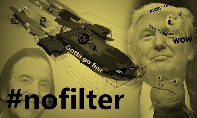
Ok, so jokes aside I did find this session helpful for turning model sheets into a perspective drawing by constructing a basic grid structure. I ran out of time and had a funny thought which is why the final thing ended up like this.
EDIT: I went back to this and quickly redid it to end up with this.
3 Point Perspective VD-S18
So this session of Visual Design got us to take the perspective room from one of our previous projects and turn it into a 3 point perspective image. I enjoyed the challenge but found it hard to convert so I was not able to finish it.
Colouring Yoda VD-S20
This weeks visual design lesson had us look at colour and saturation. We watched a video that covered the basics and then put it into practice by colouring some grey Yoda art.
Tree with Character
This weeks Visual Design project was to design a tree with character. Not a character that is a tree but a tree that has character to it. So to start I created a moodboard of trees.
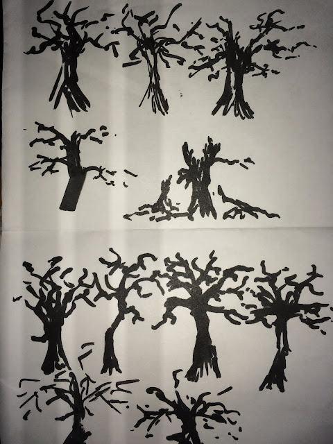
Next I created some roughs on paper and some sketches of bark for reference.

 Then I created more roughs in Photoshop.
I chose to take 3, 4, and 6 further.
I decided I liked the middle tree the best and I knew I wanted to have lightning in the final piece. I am very happy with how it turned out but I think that there should have been less rim lighting on the right hand side of the tree.
Next I created some roughs on paper and some sketches of bark for reference.

 Then I created more roughs in Photoshop.
I chose to take 3, 4, and 6 further.
I decided I liked the middle tree the best and I knew I wanted to have lightning in the final piece. I am very happy with how it turned out but I think that there should have been less rim lighting on the right hand side of the tree.
Subscribe to:
Comments (Atom)


